Posts

Showing posts from January, 2020

Contents Page: Shots
Image
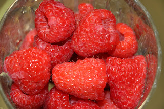
These are a few images that will used in my contents page. I plan to make a collage of some of these images, which can be seen on the next post. Some of these pictures may look familiar from my practice shots, but if they were not used within another element of the magazine, it will be used in my contents.

Layout Process

Image
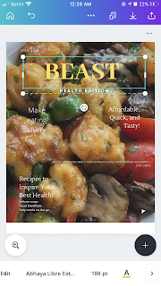
I used this template from Canva, which intrigued me because of the masthead and the elegancy of the  image. I replaced the original image with my image that was shown in the ‘Final Cover Process-Finalized’ blog post. Then, I added all of my subtitles and the masthead. I changed the font for a few of the subtitles and the size of the text so that it would be balanced throughout the cover page. The template I used on Canva did not have a barcode, so I used PicsArt and chose a barcode image from their many options. I applied the barcode to the bottom of the image since that it is were it is usually found. This is the finalized image for my cover page.

Masthead Process

Image
At first, I was using colors that I felt might stand out to audiences. However, when I asked my classmates how they felt about it, they said that the masthead should go with the subtitles to make it more aesthetically pleasing for the readers. In the end, I chose a font that was less wide and bulky and changed the font color to white to match the subtitles within the cover page.

Practice Shots (Part 2)

Image
These are some more practice shots, but they will be used for my feature story. These images were taken with the lighting/set up that was talked about in a previous blog. The images were all taken on an iPhone 8 Plus, but more shots may be taken before I finalize the feature story.

Final Cover Process-Finalized

Image
Editing  First, I cropped out the background to eliminate any distractions.  The red indicates what I wanted to keep and the background was filled with black. This was the first outcome, however, I did not like the way that the picture was cropped. With that being said, I re-cropped it. I liked how this image looked better because it was more circular and will allow for the text to surround the image. Some blur was added so that the image was focused more on the food and not so much on the background. This is the final image that will be used for the cover page.

Practice Shots (Main Cover Shots)

Image
These images are practice shots that will most likely be used for the contents page or for the cover page. I find that audiences are usually attracted to shots of food that make them crave a certain meal or look appetizing. These images were taken over a span of time, some being homecooked meals and some being from restaurants. Homemade ground turkey lettuce wraps. Yogurt parfait. Pork meal from restaurant.  Homemade strawberry smoothie. Acai bowl from restaurant. Homemade meal. Shrimp bowl from restaurant. 

Lighting/Shot Set Up

Image
For my lighting, I used umbrella lights because they provide a more balanced light in the kitchen and in the room that I took the image for the feature story in. The lighting in these rooms is not as vibrant as I would have wanted them, so the umbrella light made up for this. The set up consisted of my kitchen and  kitchen utensils because my magazine focuses on the dietary part of a healthy lifestyle.

The Reinforcement Theory

This theory describes that the only time the media can influence people is when it introduces a new idea or concept. It generally states that people seek out and remember information that provides support for their beliefs. There are particular attitudes and beliefs that are unlikely to change because attitudes on certain topics are crucial to individuals' self-image.   Reinforcement theory argues that the media confirm audience beliefs and attitudes rather than create new ones. It is a simple theory that many people go by, especially older people because they like to have hardcore evidence to support them throughout their arguments.