Posts

Showing posts from October, 2019

Preliminary Task Evaluation

Preliminary Task Evaluation  Evaluation This preliminary task has helped me to generate ideas of what my final magazine cover might consist of. Also, it has helped me practice my editing skills and get familiar with different programs to help me create my magazine. Throughout the next few months, I hope to get as close to perfect as possible in editing with InDesign and Photoshop to create me magazine. Layout Both of my magazine covered had the title in the center with the model in the middle/center. Both magazine covers have one model, which I plan to only use one model for my final magazine cover as well.  Text Styles My title is bold and will always be bold because I want it to stand out. However, the subtext is a fine text and smaller because I want the central image to be the main point of attraction. The fonts and colors remain consistent. Photography For the cove page, I have decided to only use one model for the central image because it create

Preliminary Task: Cover Page

Image
For my preliminary task, I have decided to create two magazine covers. I have edited them using various apps, and I will be doing more of these to perfect my editing skills.

Preliminary Task: Plan

For my preliminary task, I will be creating a cover page with a cover image and different subtitles that will intrigue readers. Also, I will be doing a draft of a double-spread feature page, possibly doing an interview with someone who engages in fitness activities daily. Within this preliminary task, I would like to ask a few of my classmates if it intrigues them and what changes I could make that would make them pick up the magazine and actually read it.

Double Page Analysis

Image
This is a template for a double-spread feature page that I would like to use to help me when I complete my task. The elements will help me figure out how I want to layout my feature page. Resources: Google Images

Survey Results

As stated in my pervious posts, we will be analyzing the results from my survey: https://www.surveymonkey.com/analyze/UWFRAbM3o6OET6UKgPAe_2Fj1mfFIk8wBhTjZyjNY73Bk_3D

Fitness Magazine Questionnaire

Questionnaire In order to compose my magazine, I will be asking some of my classmates a few questions, which include: 1. What do you expect to see on the front page when you look at a fitness magazine? 2. How often do you workout? 3. What is the best color scheme for a fitness magazine? 4. Which magazine title would intrigue you more, BEAST or FIT? 5. What type of fitness activities do you engage in? 6. What grade are you in? 7. What do you expect a fitness model to look like? The results of this questionnaire will be in my next blog post.

Why?

Why did I pick a fitness magazine? Many people may be wondering why I picked a fitness magazine to compose, or maybe why I didn’t pick something such as fashion or cosmetics magazine. When most people think of a fitness magazine, they don’t think they will see teenagers in the magazine, it’s mostly just older adults that have been bodybuilding for many years. However, with my magazine, I want my audience to be able to see that fitness does not pertain to a certain age group, it can pertain to anybody. You do not have to workout everyday or eat healthy at all times, but there are easier ways to get fit rather than being in the gym for 6 hours a day and only eating salads. My magazine will feature multiple teenagers who will reach out to an audience to help them stay fit without the type “bodybuilder” body. I want everyone to know that they don’t have to have that hard 6-pack of abs or the strongest biceps to be consider fit!

Cover Page Analysis

Image
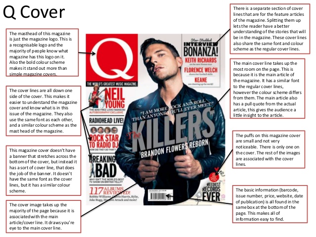
Cover Page Analysis Along with the central images, there is more than just a picture on the cover page. The cover page is the most important part of a magazine. This page is what captures the audience's attention and ensure that they pick up the magazine to read it. Credit: Google Images

Central Images

Central Images When we look for a magazine, we don't usually look at the contents page first or a feature page. We always look at who is the central image of the magazine. There are a few reasons why we are attracted to this image: Humans are attracted to visuals. We do not focus on listening to other people, we usually just look at the focus. We process images quickly. Bright colors capture our attention because our brains are wired to react to them. Something with an image is 10 times to more likely to be read/engaged with. Images help us learn, some of us may be visual learners, which allows people to learn more effectively with images. Reference: blogs.biomedcentral.com/bmcblog/2014/08/11/the-power-of-pictures-how-we-can-use-images-to-promote-and-communicate-science/

My Inspiration

Image
Inspiration Board As part of the main task, my teammate and I have discussed our theme for our magazine and what we would like to incorporate in our individual project. We have decided that we will be creating a fitness magazine, including workouts and/or healthy recipes that are easy for teenagers to make. We will include images of our models and some workouts they do to stay fit. My inspiration for my magazine includes some of the following: 

Mastheads

Image
Different Types of Masthead The masthead is the title of a magazine or newspaper at the head of the front page. Every masthead is different for each magazine, which gives the magazine a different style. The masthead has a different purpose, such as, standing out to the readers with bold lettering or intriguing them with the different fonts being used. Some examples of different masthead include: 

Codes & Conventions

Image
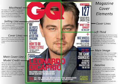
Codes & Conventions Every single magazine follows the generic codes & conventions to create the magazine. Although each company/brand follows the same conventions, they have different aspects that make the magazine pop .  Masthe ad:    The title of the magazine, usually in bold letters and is instantly recognizable and attracts readers. Tagline: Shows what the magazine or who the magazine is about. Coverlines: Gives the audience an idea of what the magazine consists of. Central Image: A large image that covers the whole front page of the magazine, which is usually what causes the reader to pick up the magazine. Cover model: Usually celebrities, which makes the reader feel connected with the magazine and attracts them to it. Colour Scheme: The colors that tie the magazine together and may target a certain age group/audience. Barcode: Located usually in the bottom left or right corner and allows the reader to purchase the magazine. Bibliography : Jor

Marketing

Marketing There are multiple ways to market a magazine, but many companies do a couple of things that increase their sales rapidly, such as: Advertising: Online ads, making a website, or promoting your magazine on social media allows your brand to become known. Word-of-mouth is one of the easiest ways to market your magazine; once one person likes it, they will tell multiple people which results in them buying it.  Emails: Emailing targets a specific audience and send specific emails that will target these individuals. Whether you are talking about the biggest fashion trends that are in now or budget-friendly recipes, someone will click on your email and purchase your magazine. Also, many magazine companies offer a subscription for an annual or monthly deal in the emails.  Social Media: Posting pictures promoting your magazine or tweeting about how your magazine will be on shelves soon will entice the audience. They will be curious about what you are writing about or the

Genres of Magazines

Image
Genres                  Recently, I have been researching different genres of magazines that are published. The publisher chooses a genre that will appeal to their audience and do well in the magazine industry. These genres include fashion, sports, fitness, health, entertainment, lifestyle, education, etc. While researching, I have become interested in making a health/fitness magazine because many teenagers may want to have a healthier lifestyle, but it may be hard for them. With my magazine, it will be relatable and include ways to become fit with a busy schedule/without having to pay a gym membership every month. Examples of different magazine genres include: