Posts

Showing posts from November, 2019

Photoshoot Plan

For my photos, I plan to take them on a track that is near my house where many people work out. I want to take action shots of my model running and really being active. Another site I want to use is the gym, I can take pictures of my model lifting weights or on the machines. Finally, I want to have setup with the lighting focusing only on the model with no distractions in the background. This will allow the audience to only focus on the main model and the subheadings of the cover page if I choose to use it as the cover page image.

Incorporating Food

Image
When incorporating different elements into my magazine, I wanted to include food because it impacts our body in so many different ways. Food allows us to get fuel/energy, changes our weight, and is something that we eat everyday. Seeming as though it makes such a large impact on our lives, I want to include the different recipes that are easy and affordable for everyone to make. This will allow us to become healthier and eat out less. 

Potential Models

Image
Here are some pictures of potential models that I will be using. I chose them because although you can’t tell in the pictures, they are very fit and athletic, plus they are in the same age group as many readers of my magazine will be.

Color Scheme

Image
This magazine has red, black and blue. These bold colors capture the attention of the audience to text, but not as much to the center picture. This magazine has blue, yellow, and black. The background color is fully blue, which centers the attention to the model, unlike the previous magazine. This magazine incorporates that blue/gray color and yellow too. The lighting of the image plus the gray shadows accentuates his muscles and really makes him the center of attention.

Gender Representation: Male vs. Female

Image
In fitness magazines, males are usually represented, while women are put on the back-end. However, in my magazine, I would like to use more women-of-color, rather than men. Men are usually used in these magazines because they are more muscular and have ideal bodies that make others want to workout; they have more of an influence than women in some people's eyes. Women can make just as much of an impact that men do. Through my magazine, readers will be exposed to diversity, within the cover, table of contents and double-page spread. 

Interview Video Analysis

In my interview video, I surveyed one of my classmates in which I asked her a few questions about my magazine. I asked her what color scheme she would expect to see, what content she would expect to see, etc. She said that she would like to see bold color schemes, healthy meals that are easy to make, and workouts that can be done at home. I will be implementing all of these ideas within my magazine and will be doing more interview videos so people can critique my sample pages. I will be doing another video to critique my rough draft of my cover page to see what I can improve on and add to it.

Interview Video

Image

Fitness Magazine Interviews (Examples)

Image
These are a few examples of interviews for fitness magazines that I will take inspiration from. There is not much diversity in these interviews, but my interview will be including someone of color and someone that can relate to many more students of my age.

Interview Questions for Double-Page Spread

For my double-page spread, I am considering interviewing someone having to do with their fitness journey. I have come up with some possible questions to ask them, just in case this does pan out how I want it to. 1. Do you feel pressure to be in shape? 2. When did you start working out? 3. Do you believe that it is a necessity to eat healthy while working out? 4. What's your typical workout routine? 5.What do you like best about your body? 6. What's the best way for someone to motivate themselves to get fit? 7. Do you think becoming fit boosted your self-confidence? 8. Why did you decide to start working out? 9. Has working out become a part of your everyday routine? 10. What is the best thing working out introduced you to?

Planning my Content

Throughout my blog posts, I have identified my inspiration for the layout of my magazine. However, I have not described specifically what my magazine will consist of. For my content, I will be having recipes like: Lemon Pepper Chicken with Vegetables Different Types of Salads Breakfast Smoothies For my double-page spread, I will be interviewing someone who went for extremely skinny to fit and finding out what they did to gain muscle. I want teenagers to know that they are able to do it, whether they think they can or not.  Also, I will be including workoutS such as: Ab Workouts at Home with just a Basketball Quad Workouts for the Gym Arm Only At Home and at the Gym

Audience Profile

My magazine is about fitness and health. I want teenagers and adults to read my magazine for inspiration for their "goal" body. The content will be mainly read by teenagers because I want to include home and gym workouts, for the fact that not everyone can get a gym membership. I know some people may make excuses that they are not able to workout because of them not having a gym membership, but with the home workouts that I will include, they have no excuse. Also, my magazine will be including easy, healthy recipes that can be cooked by anybody. Many teenagers do not know how to cook and if they do, it's probably something which is loaded with carbs and not enough protein. The magazine will help readers become healthier and possibly end up with the body that they have been longing for.

Contents Page Inspiration

Image
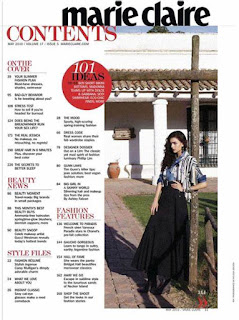
These are some inspiration pictures for my table of contents for my fitness magazine. I will be taking a few ideas from these images and adding my own touches to it. My contents page will be a single page, organized in columns and with bold colors for the page numbers.

Contents Page Research

Image
Contents Page Research  The title "Contents" is always clear and bold, being the largest text on the page.  The page is usually divided into columns and is neat for the audience to read and navigate through the magazine. The main image on the page is the largest and usually means that it will be the main focus/feature of the magazine. There are a range of subheadings throughout to link what will be going on throughout the magazine. Also, there will be numbers next to the subheadings to indicate what page that topic will be on. There will usually be a small caption under the subheading to give a brief description of what the article will be about.